In the last six years or so, I’ve had the fortune to mix things up with economic projects. Through the City of Beaumont, the Southeast Texas Economic Development Foundation, land development firms, and other groups, I have somehow found myself up to my elbows in economic topics that I never expected. And it’s quite fun and fascinating.
So when the highly decorated firm of GMJ (Griffith, Moseley, and Johnson Inc.) approached our agency to overhaul their website and elevate their branded digital presence, I was eager to get to work and use some of this newfound knowledge of the industry. Putting design, functionality, and strategic messaging for GMJ in a sharp digital layout was fun and fulfilling.

We started out this project with a series of meetings and phone calls to review goals, objectives, challenges, and problems to solve.
The surface level for so many websites such as GMJ’s is that they just want a newer, better website. This is a common phrase I hear, but I am quick to respond with a few questions that help steer things away from the subjective (which is exactly what “better,” “cooler,” and other terms are) and to the objective. When we can solve a problem or speak directly to an audience, that’s the best place to hit. The cool, new, better factors can all follow along.
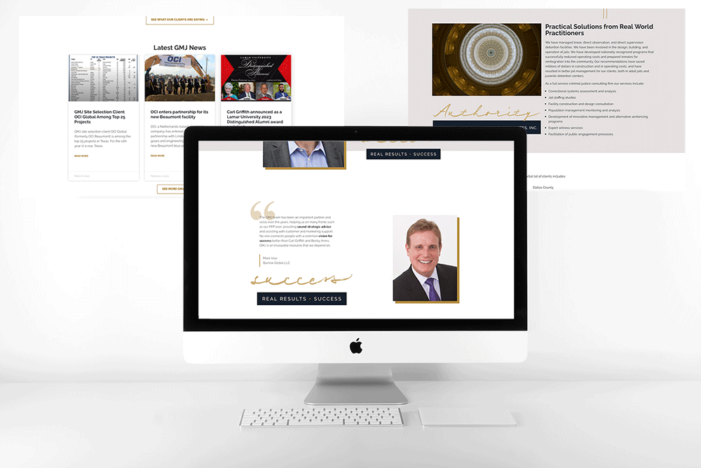
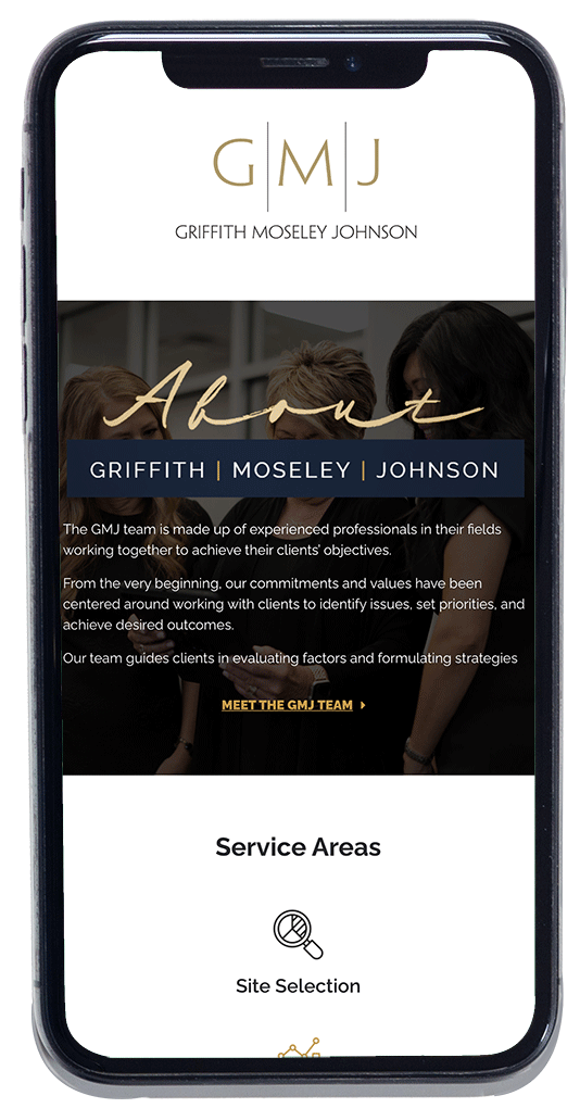
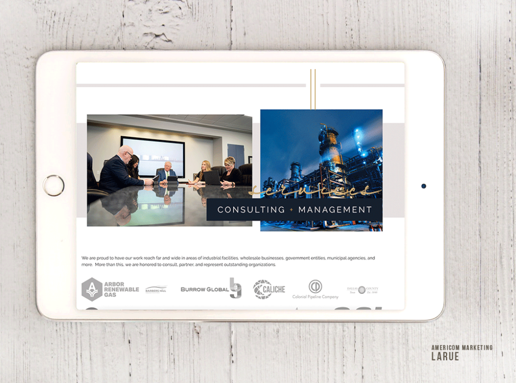
The home page is full of content and navigational tools to help the viewer do the driving. At a glance, we wanted to show what all GMJ Inc. does and the far range of success and authority of each subject area.
With Carl Griffith, Becky Ames, and Jeff Moseley and the team’s rich knowledge and experience, they have much to share. So it was important to break things up into bite-size pieces, categorize, and organize into areas that the viewers can successfully consume.

The type of industry and clientele have a lot to do with website design, especially with such an informational site. Theirs is the type of site that viewers don’t just stumble upon. Though that is always welcome, this is likely a tertiary step in the decision-making process to verify and approve.
By this, I mean that to visit this website and really dig into the information is probably part of a series of steps in a decision-making procedure for a company or organization. It is likely that there was a referral involved or a few lead-ups before someone digs eight pages deep into the content of a site such as this for a businesses such as this. This is the step where the viewer is seeking proof points, examples, and confirmation of their motivation, if not their decision.
The alternative is that this is part of the final stage in the disproval. As in, they have all the information they need to make the decision and they’re about ready to proceed…but the viewer checks it out as if to say, “let me prove you wrong and find the flaws.” To counter, that we have to answer the questions before the viewer asks.
It’s not dissimilar to a shopper who reluctantly walks around with a shirt or jacket in the retail store talking himself or herself out of buying it. Trying to justify the purchase only goes so far, so one may have to consider the too-good-to-be-true variants and so forth. Simply put, there is a point in the buying process that is problem-seeking rather than problem-solving.
Designing this GMJ site was a great joy, and I embraced working through these types of things to result in giving viewers “overwhelming evidence” that yes—this is a good decision. And that goes well beyond “cool,” “better,” and “newer.”
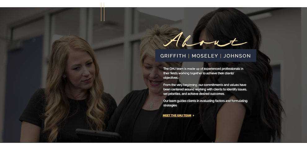
The navy blue and gold in their logo struck me as more than just good brand colors. It’s the sophistication, the class, and the pace of the brand. The gold is regal and represents legal, financial, and maturity aspects while the navy blue symbolizes confidence, experience, energy, and financial astuteness.
I added pinstripes and heavy blocks with sharp corners for the precision of this type of business and these types of individuals. Anything less than precise doesn’t cut it in this industry, so no circles and rounded edges; this calls for sharp, direct, and bold art elements.

This was a really good project that involved content creation, design, marketing, and a concentrated effort on brand identity. Though we didn’t create their logo, we created new ways to display it and feature it in context with valuable support pieces.
The personal touch aspect of the cursive writing for power words helps to serve the angular, staunch design elements on the other side. It was good to work through A to Z. Blake Royer, my partner in code and design, did a fantastic job of making the design come alive. The bulk of this is built in Elementor with some smart techniques of which he is so masterful.
Americom Marketing launched this site recently. I really enjoy working with the team. It was a design I did almost a year ago, but finally launched and it’s awesome to see it live and getting clicks.
Check it out here at http://www.gmjinc.com/
SEE MORE WEBSITE DESIGNS HERE LEARN MORE
